
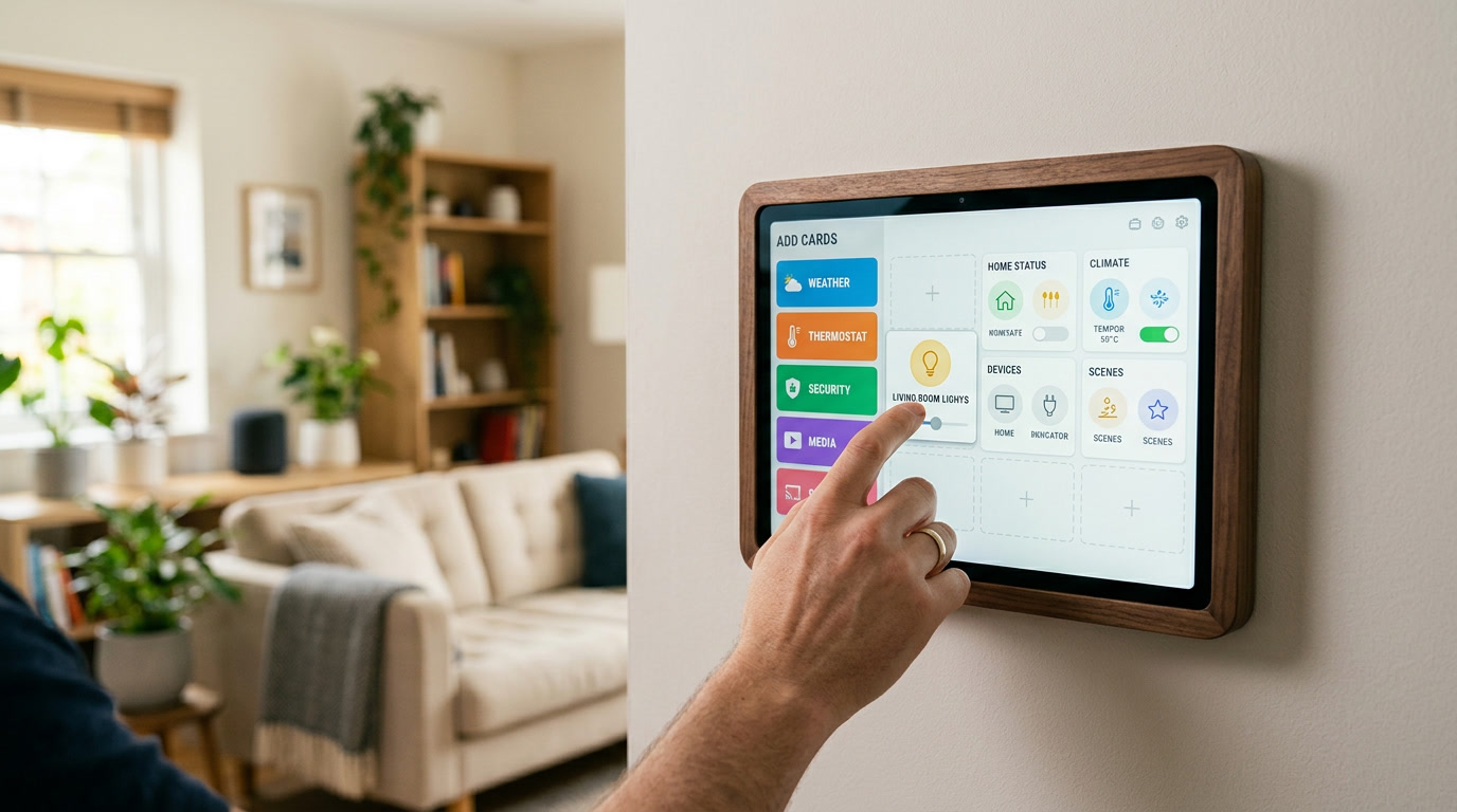
When I first heard that Home Assistant dashboards could be fully customized, my honest reaction was mild dread. I am not a developer, I do not particularly enjoy staring at configuration files, and the idea of learning a markup language just to move a light switch card two inches to the left sounded exhausting. What I did not realize at the time was that the platform’s built-in visual editor had matured to the point where you genuinely never need to touch a line of code unless you want to. Everything from layout to colors to which devices appear where can be handled entirely through point-and-click menus.
If you have been putting off customizing your dashboard because you assumed it required programming knowledge, this guide is for you. We are going to walk through exactly how to reshape your dashboard using nothing but taps, clicks, and drag-and-drop, so your smart home solution finally looks and feels the way you actually want it to.
Why the No-Code Path Is Genuinely Enough for Most People
There is a persistent myth in online forums that “real” customization requires editing raw configuration files. That might be true if you want extremely niche, highly specific behavior, but for the overwhelming majority of households, the visual editor covers everything: adding cards, rearranging sections, changing icons, grouping devices by room, adjusting colors, and even building entirely separate views for different family members.
I say this as someone who spent an embarrassing number of hours convinced I needed to learn YAML before I even tried the visual editor properly. Once I actually explored it, I realized most of what I wanted to achieve took minutes, not hours, and required zero technical background.
Getting Into Edit Mode
Every customization journey starts in the same place. Open your dashboard, and look for the three-dot menu, usually tucked into the top right corner of the screen. From there, selecting the edit option immediately transforms your static dashboard into an interactive canvas. Cards become draggable, a plus button appears for adding new sections, and each existing card reveals a small settings icon you can tap to adjust its details.
This single toggle is the gateway to essentially everything covered in this guide. There is no hidden menu, no separate app, and no technical prerequisite beyond simply knowing this button exists.
Rearranging Cards Without Touching Code
Once you are in edit mode, moving cards around is as simple as pressing and holding, then dragging a card to a new position. On a desktop browser, this usually works with a standard mouse drag. On mobile, a slightly longer press activates the same drag behavior.
This alone solves one of the most common early frustrations beginners run into: a dashboard where the most-used cards are buried at the bottom of the screen while rarely-used diagnostic entities sit right at the top. Spend just five minutes reordering things based on what you actually check daily, and your dashboard immediately starts feeling more like a personal tool and less like a default template.
Adding New Cards Through the Visual Picker
When you tap the add card button, you are presented with a searchable list of every available card type, along with a live preview of how it will look before you commit to adding it. You do not need to know the technical name of a card in advance — descriptive titles like “Thermostat,” “Camera,” or “Weather Forecast” make it easy to browse and select exactly what you need.
After choosing a card type, a configuration panel walks you through selecting which entities to attach, what title to display, and various optional settings like icon choice or color. Every single one of these choices happens through dropdown menus, toggles, and text fields — never raw code.
This is where a smart home solution really starts to feel personalized rather than generic. You can build a card showing only your bedroom lights, another showing just your kitchen appliances, and another dedicated entirely to security devices, all without writing anything beyond plain English labels.
Grouping Entities Into Areas
If you have already assigned devices to specific areas within your Home Assistant settings, the area card becomes an incredibly powerful no-code shortcut. Rather than manually building a card for each room and individually selecting every device, you simply point the area card at “Kitchen” or “Living Room,” and it automatically populates with everything already assigned to that space.
Setting up areas themselves is also entirely visual. Under your settings menu, each device can be assigned to a room through a simple dropdown selection. Once that groundwork is in place, building room-based dashboard sections becomes almost instant, since the platform does the organizational heavy lifting for you.
Customizing Icons and Names Without Code
Default entity names are often technical and unfriendly, something like a manufacturer’s internal product code rather than anything resembling plain English. Fortunately, renaming any entity is as simple as opening its settings panel and typing a new name into a text field. The same applies to icons: a searchable icon picker lets you choose something visually intuitive, like a sun symbol for outdoor lighting or a shield for a security sensor, all through clicking rather than typing configuration syntax.
Small as this sounds, renaming and re-iconing your entities has an outsized impact on how usable your dashboard feels day to day. A card labeled “Front Porch Light” with a recognizable icon is instantly understandable, while a card labeled with a raw device identifier forces you to stop and think every single time.
Creating Multiple Views for Different Purposes
Most people eventually want more than one tab. Maybe you want a main overview, a dedicated security tab, and a simplified guest-friendly view. Adding additional views is handled entirely through the same visual editor, using a plus icon typically located near the top navigation strip. Each new view gets its own icon, title, and independent set of cards, letting you build a genuinely tailored experience for different situations without any coding involved.
This is particularly useful for households where not everyone wants — or needs — access to the same level of detail. A simplified guest view might show only lighting and thermostat controls, while your personal main view retains full access to security cameras, automation toggles, and diagnostic information.
Adjusting Layout and Column Structure
Beyond individual cards, the overall structure of your dashboard can also be adjusted visually. Many dashboard types allow you to switch between different column layouts, letting you decide whether cards stack in a single vertical column, spread across two or three columns on larger screens, or adapt responsively between desktop and mobile automatically.
This layout flexibility means your smart home solution can look genuinely polished on both a large kitchen tablet mounted on the wall and a small phone screen, without requiring separate configurations for each device type.
Using Badges for At-a-Glance Information
Badges are small status indicators that typically appear near the top of a dashboard view, showing things like outdoor temperature or how many people are currently marked as home. Adding these takes only a couple of taps through the same edit interface, and they provide useful context without consuming significant screen space. I find badges particularly satisfying because they deliver meaningful information in the smallest possible footprint, which keeps the rest of the dashboard feeling uncluttered.
Common No-Code Customization Mistakes to Avoid
Even without writing any code, a few habits can still undermine an otherwise well-built dashboard.
Adding too many cards to a single view. Just because the visual editor makes it easy to add cards does not mean every entity deserves a spot on your main screen. Restraint matters just as much here as it does in coded customization.
Skipping the renaming step. It takes a few extra minutes to rename entities with human-friendly labels, but skipping this step leaves you with a dashboard that looks customized on the surface while still feeling technical and confusing underneath.
Ignoring mobile preview. Always check how your dashboard actually looks on a phone screen, not just on the browser you used while editing. A layout that looks perfectly organized on a wide desktop monitor can feel cramped or oddly stacked on a smaller screen if you never previewed it there.
Forgetting to save and test changes gradually. Rather than rearranging your entire dashboard in one sitting, make a handful of changes, exit edit mode, and actually use the dashboard for a day or two before continuing. This helps you notice what genuinely improves daily use versus what only looked good in the moment while editing.
Why No-Code Customization Is a Big Deal for Everyday Households
The broader significance here goes beyond simple convenience. A visual, no-code editing experience means a smart home solution is no longer limited to households with someone technically inclined enough to write configuration files. Parents, grandparents, and anyone intimidated by the idea of “coding” can still build a dashboard that genuinely fits their life, using nothing more than the same tap-and-drag skills they already use on their phone every single day.
This matters because a dashboard that feels approachable gets used consistently, while one that feels intimidating gets abandoned in favor of physical light switches within a few weeks. Lowering the barrier to customization directly improves how much genuine value a household gets out of their overall smart home investment.
To Sum Up
You do not need to learn a programming language, understand markup syntax, or fear breaking something to build a dashboard that genuinely fits your household. Home Assistant’s built-in visual editor, combined with a bit of intentional organization, gives beginners everything they need to create a clean, personalized, room-based layout using nothing more than clicks and drags. Take it one small step at a time, rename things as you go, preview on mobile, and resist the urge to add every possible card at once. Within an afternoon, most people can transform a cluttered default dashboard into a genuinely enjoyable centerpiece of their smart home solution, entirely without code.